Leslie Coffee Co. → Brand
- Responsibilities:
- Art Direction, Design, Development, Photography
- Timeframe:
- June 2017 – March 2022
- Tools:
- Illustrator, Photoshop, Sketch
tl;dr
- Built a complete brand identity for Leslie Coffee Co., from logo to menus and merchandise.
- Designed a locally inspired wallpaper that became a social media favorite and community talking point.
- Created a cohesive visual system that captured the shop’s warmth and personality.
Introduction
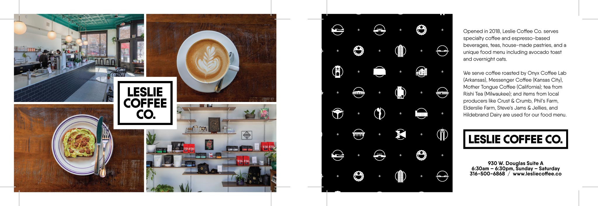
Leslie Coffee Co. was a beloved Wichita coffee shop that opened in 2018 and closed in 2025. Before it opened, and during its early years, I created all of the graphic design for the business, shaping how customers first experienced the brand.
Developing a Scalable Mark
I began with the logo, sketching hundreds of concepts in many directions to explore every possibility. Some explored coffee imagery, while others were more abstract.
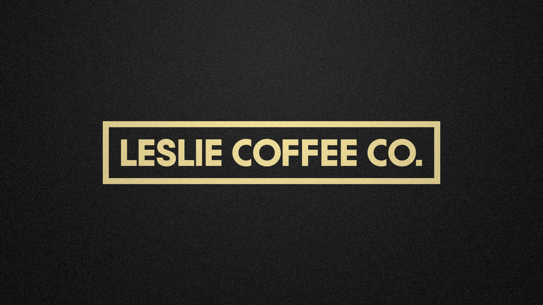
The chosen design features a stylized coffee cup and an oversized drop of liquid. The scalloped border added a friendly, approachable feel, reminiscent of a denim jacket patch.
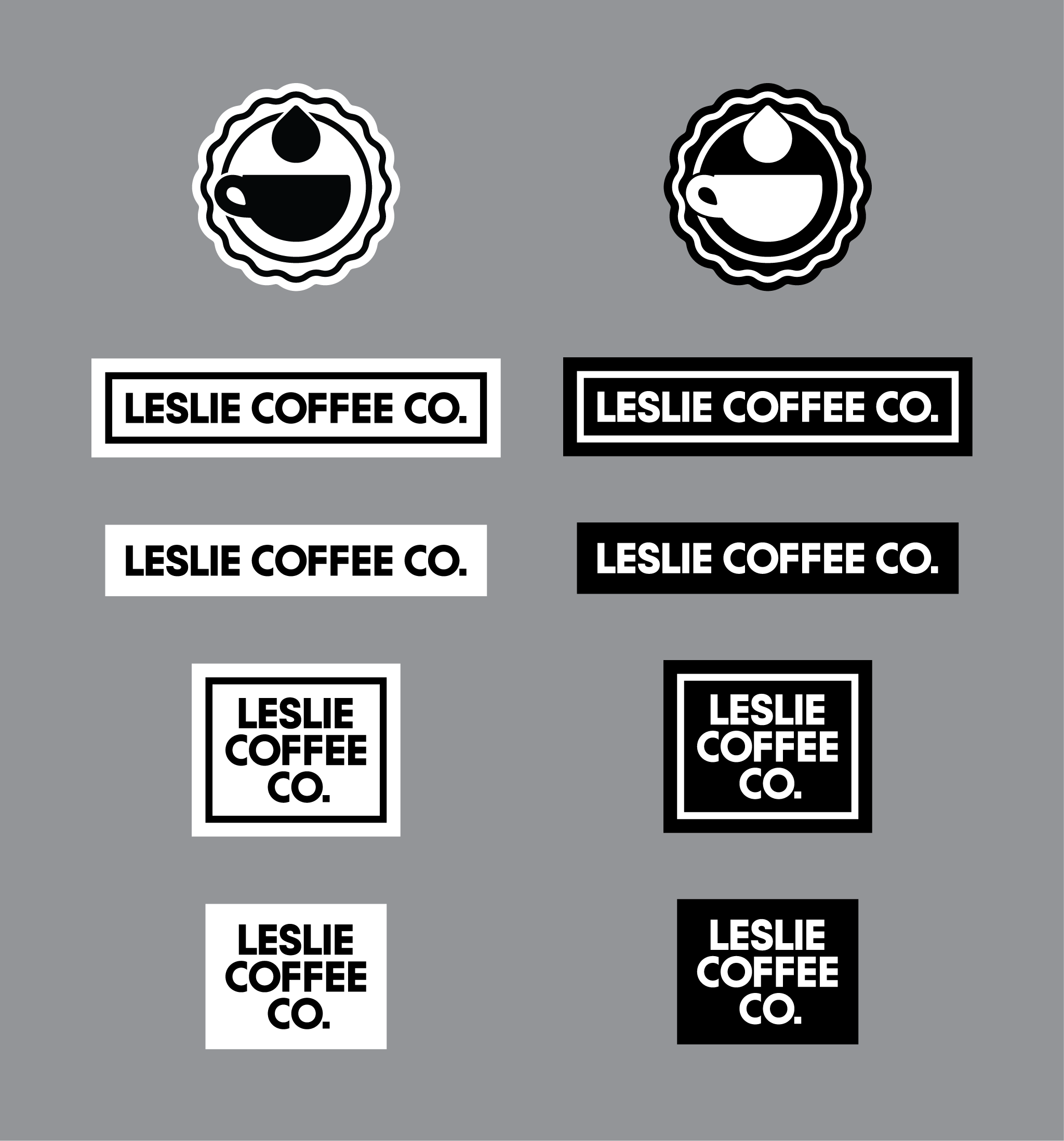
The wordmark, based on Qanelas, was customized to improve rhythm and balance. I aligned and adjusted the arms of the Fs and Es, and trimmed the Cs to prevent the CO from appearing like OO from a distance.
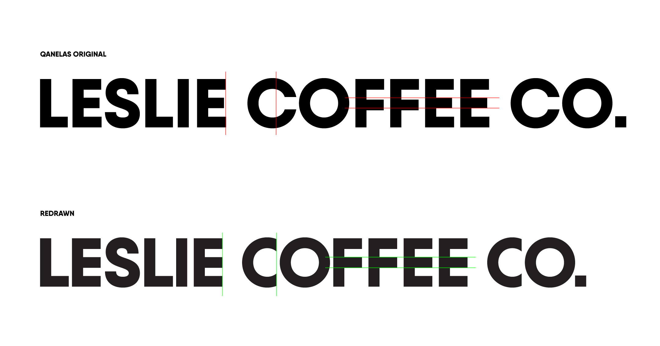
The result is a mark that feels professional and timeless, but still warm and friendly, much like the shop itself.
The Accent That Became an Icon
The owner wanted an accent wall that would draw attention, encourage selfies, and generate word-of-mouth buzz.
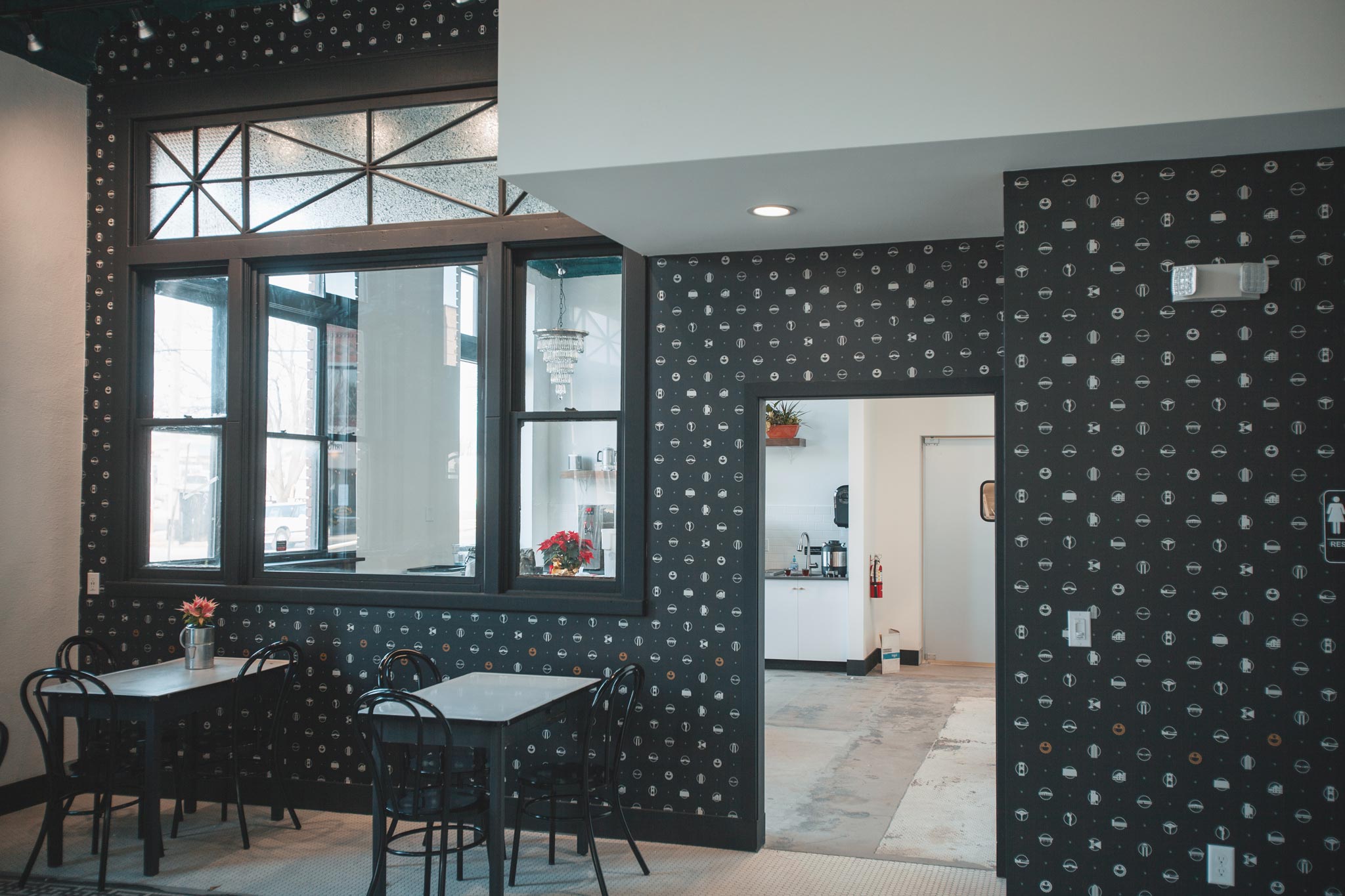
I created a repeating pattern featuring local Wichita landmarks, drawn in a simple icon style. Some icons referenced the city as a whole, while others represented the shop’s surrounding neighborhoods. The idea allowed for future expansion, where each new location could feature its own variation of the pattern.

The wallpaper quickly became a customer favorite. Visitors were intrigued from afar and delighted up close, often trying to identify each icon. The local paper even ran a story about it, highlighting how it had become a small social media phenomenon.
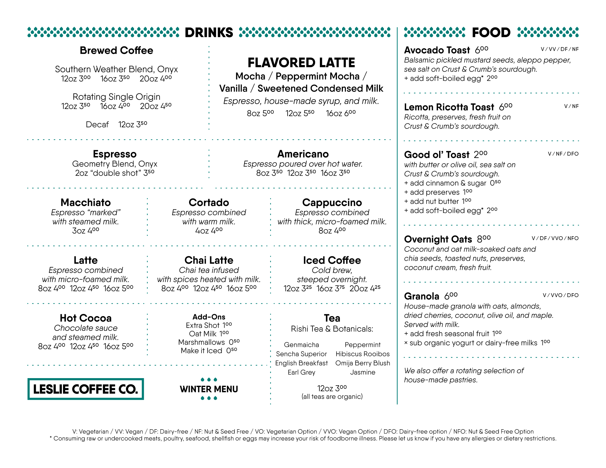
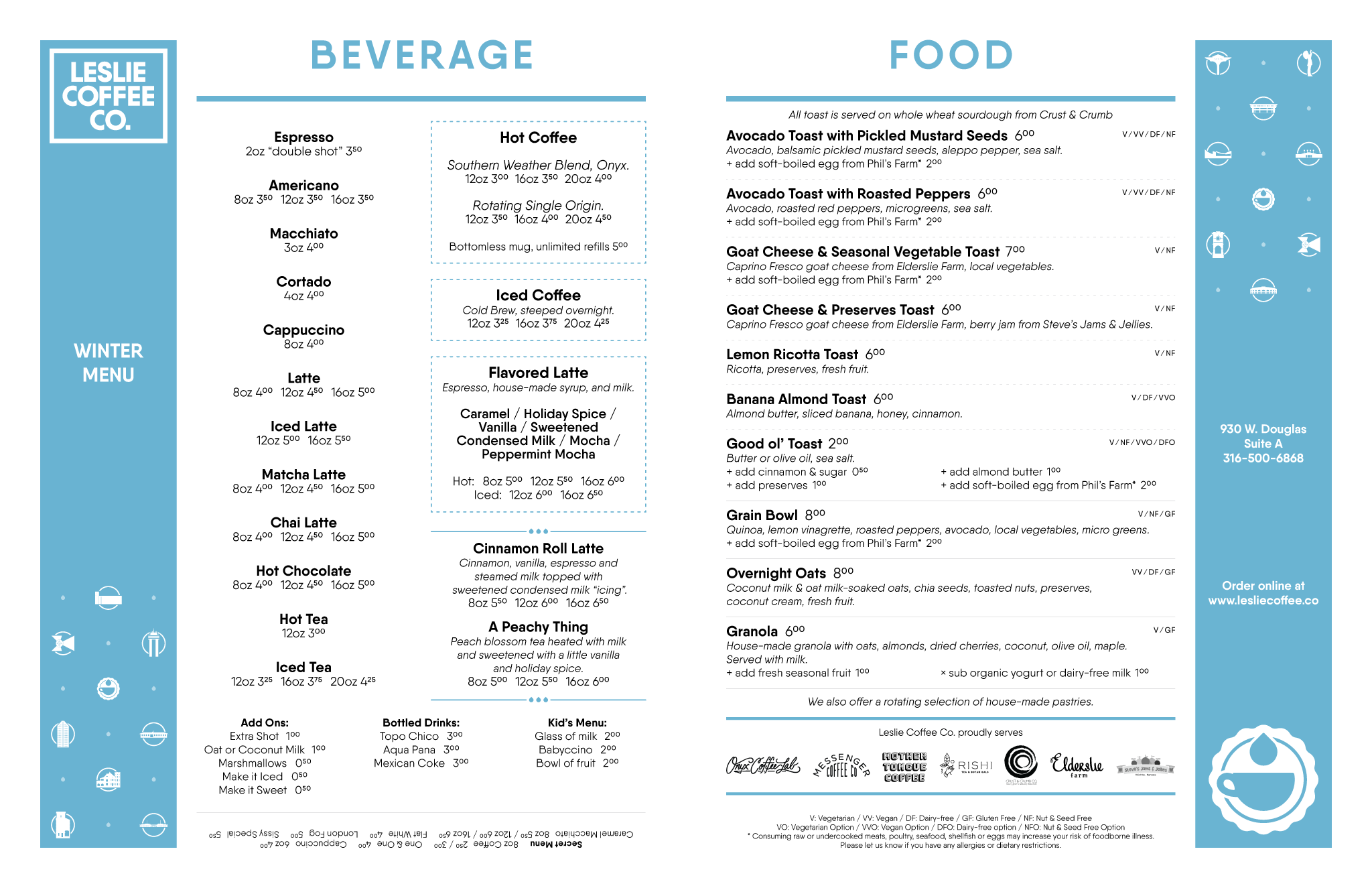
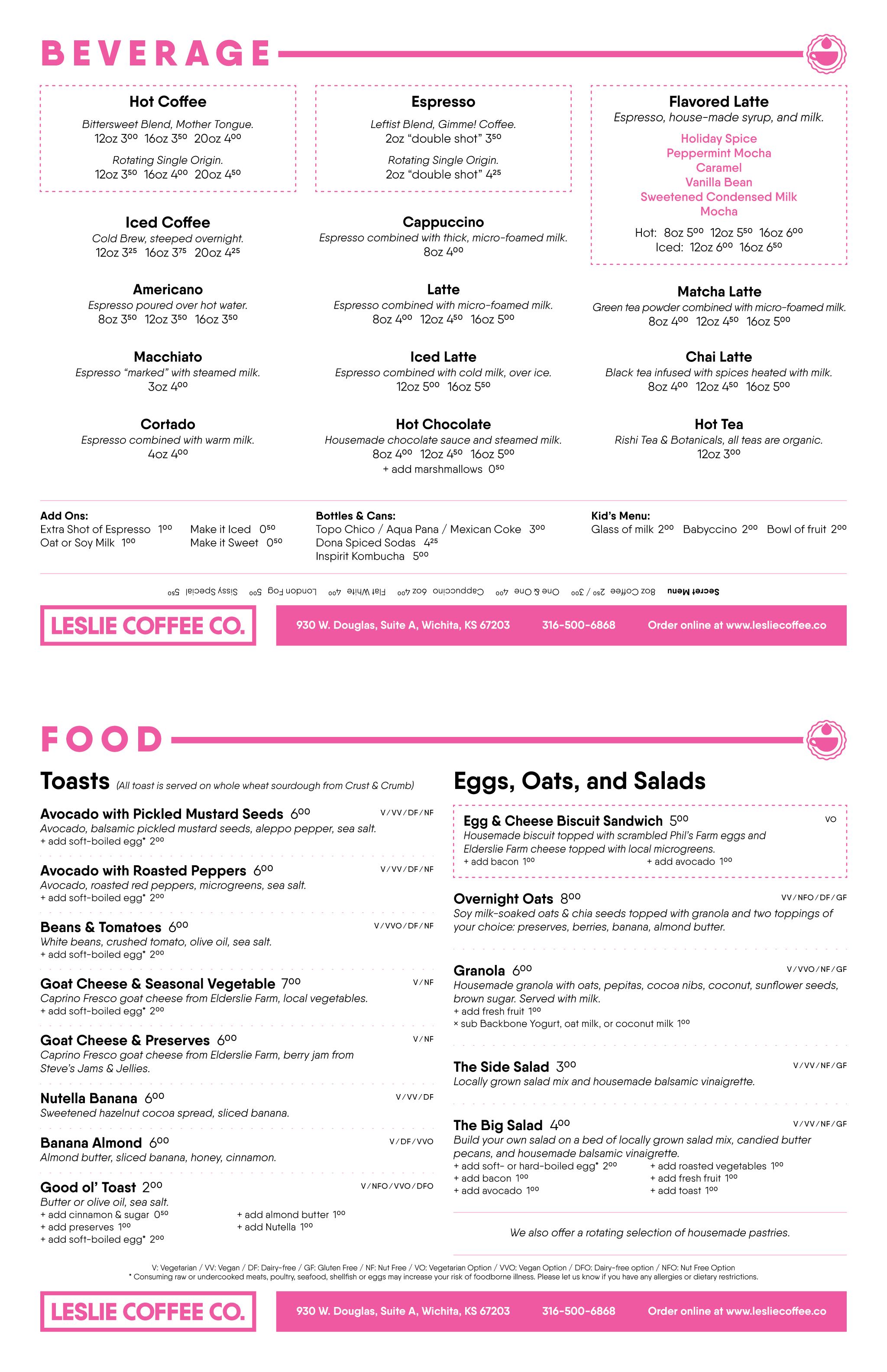
Designing for Clarity
The logo, wordmark, and wallpaper formed the foundation of the Leslie Coffee Co. brand system. One of the most important design challenges was the menu.
Many coffee shops and restaurants over-design their menus, making them difficult to read. I wanted to avoid that. My approach focused on legibility, which helped combat the sometimes stressful act of standing in line and figuring out what to order. Each quarterly menu update introduced new palette variations to keep things fresh while maintaining consistency for regular visitors.
Bringing the Brand to Life
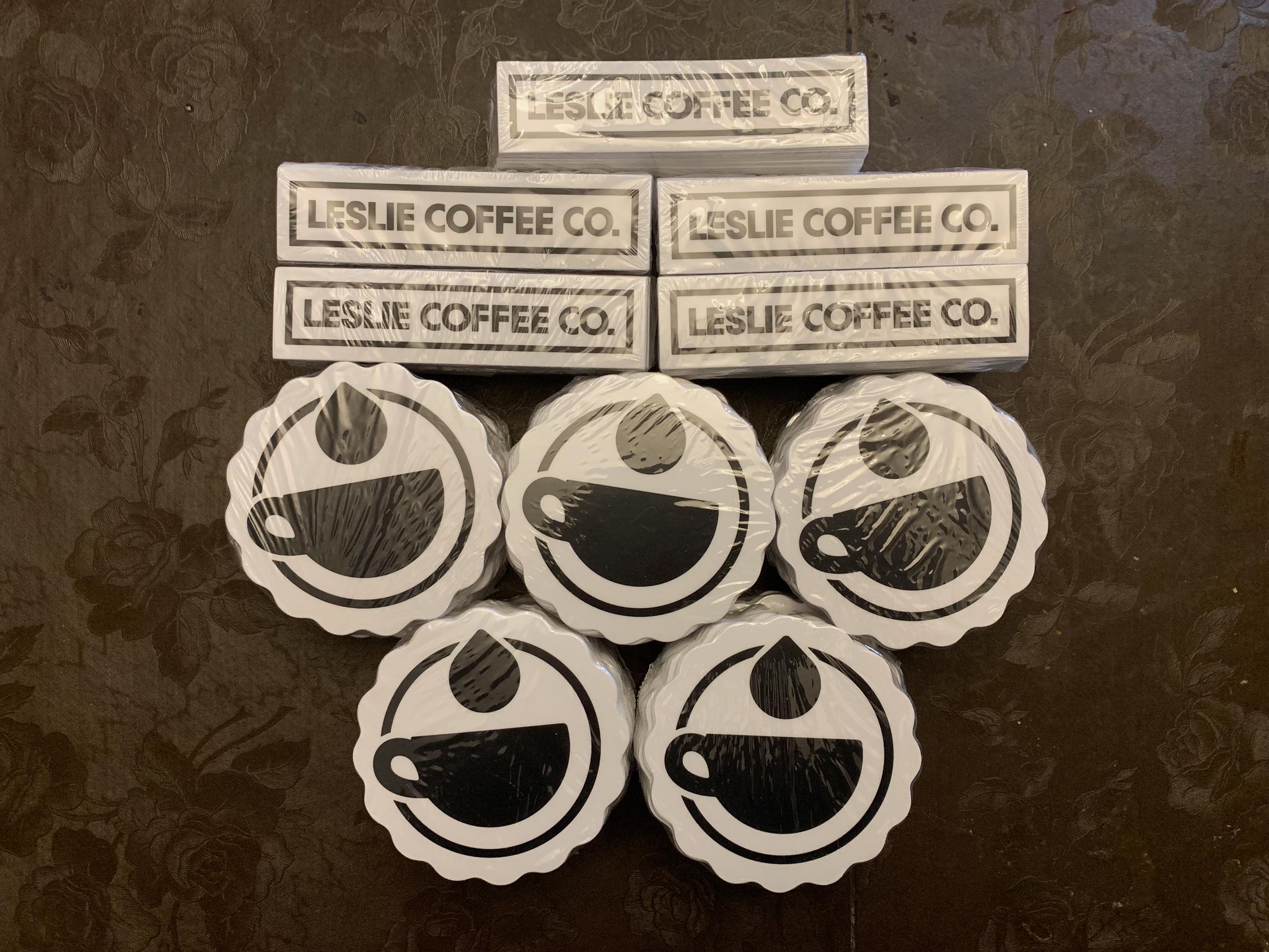
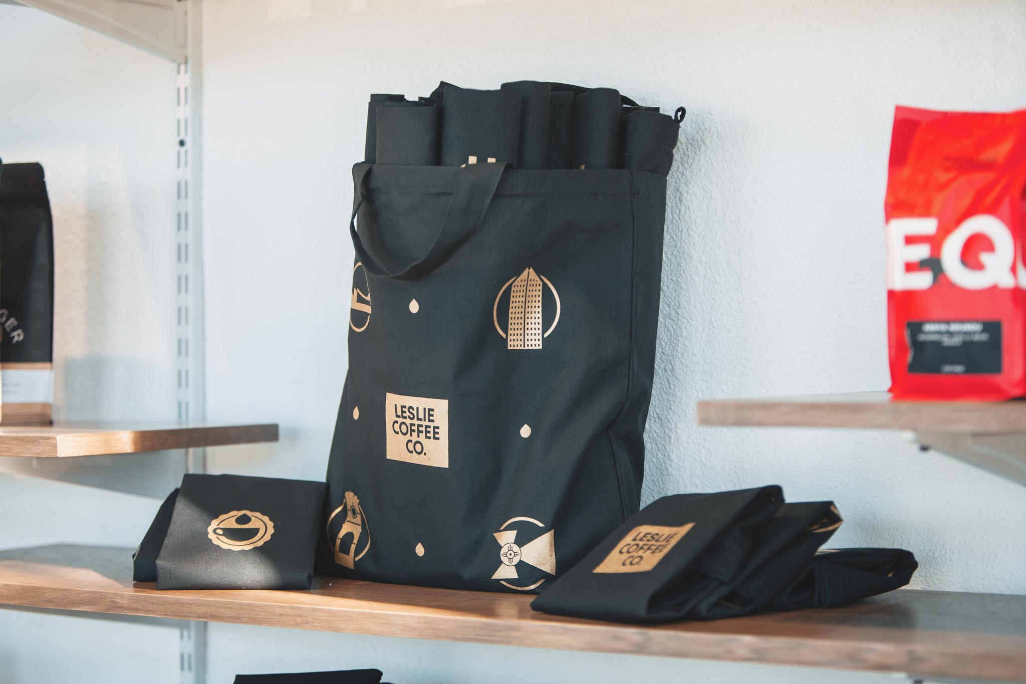
I designed business cards, gift cards, signage, and postcards. Merchandise was a big part of the brand’s reach, from simple logo items like stickers, mugs, and hats to custom pieces such as tote bags and limited-run posters. It is still delightful when I see a car with a Leslie Coffee Co sticker on it!
Design That Lingers
This project showed how a thoughtful, cohesive brand system rooted in local culture can turn a small independent business into a recognizable and loved presence in the community.